Accessibility Evaluation & Redesign: SeniorTix
Accessibility Evaluation & Redesign: SeniorTix
Accessibility Evaluation & Redesign: SeniorTix
Project Overview
Project Overview
SeniorTix is a hypothetical website that aggregates senior citizen discounts on events, outings, and activities. The challenge was to improve the usability of SeniorTix through observation and accessibility evaluation.
SeniorTix is a hypothetical website that aggregates senior citizen discounts on events, outings, and activities. The challenge was to improve the usability of SeniorTix through observation and accessibility evaluation.
Project Scope
Project Scope
Website redesign completed as part of a UX workshop hosted by Bitesize UX.
Website redesign completed as part of a UX workshop hosted by Bitesize UX.
Project Role
Project Role
UX Designer
UX Designer
Tools
Tools
Figma, FigJam, Funkify Disability Simulator, Stark
Figma, FigJam, Funkify Disability Simulator, Stark
Duration
Duration
September 12, 2023
September 12, 2023
Challenge
Challenge
Learn by observing users of SeniorTix navigate the site and identify accessibility issues
Create a high-fidelity redesign that addresses accessibility issues
Learn by observing users of SeniorTix navigate the site and identify accessibility issues
Create a high-fidelity redesign that addresses accessibility issues
Links to Deliverables
Links to Deliverables
01 CHALLENGE
01 CHALLENGE
Learn by observing users of SeniorTix navigate the site and identify accessibility issues
Create a high-fidelity redesign that addresses accessibility issues
Learn by observing users of SeniorTix navigate the site and identify accessibility issues
Create a high-fidelity redesign that addresses accessibility issues
02 ACCESSIBILITY EVALUATION
02 ACCESSIBILITY EVALUATION
Observation
Observation
Observation
To assess SeniorTix's accessibility, we observed two users navigate the site:
Michael, 68: red/green colourblind & low vision
Janice, 71: mobility/fine motor disabilities (shaky hands) & low vision
Original SeniorTix site: Original Prototype
To assess SeniorTix's accessibility, we observed two users navigate the site:
Michael, 68: red/green colourblind & low vision
Janice, 71: mobility/fine motor disabilities (shaky hands) & low vision
Original SeniorTix site: Original Prototype
Main accessibility issues observed:
Low contrast and small text size makes it difficult to read.
Main accessibility issues observed:
Low contrast and small text size makes it difficult to read.
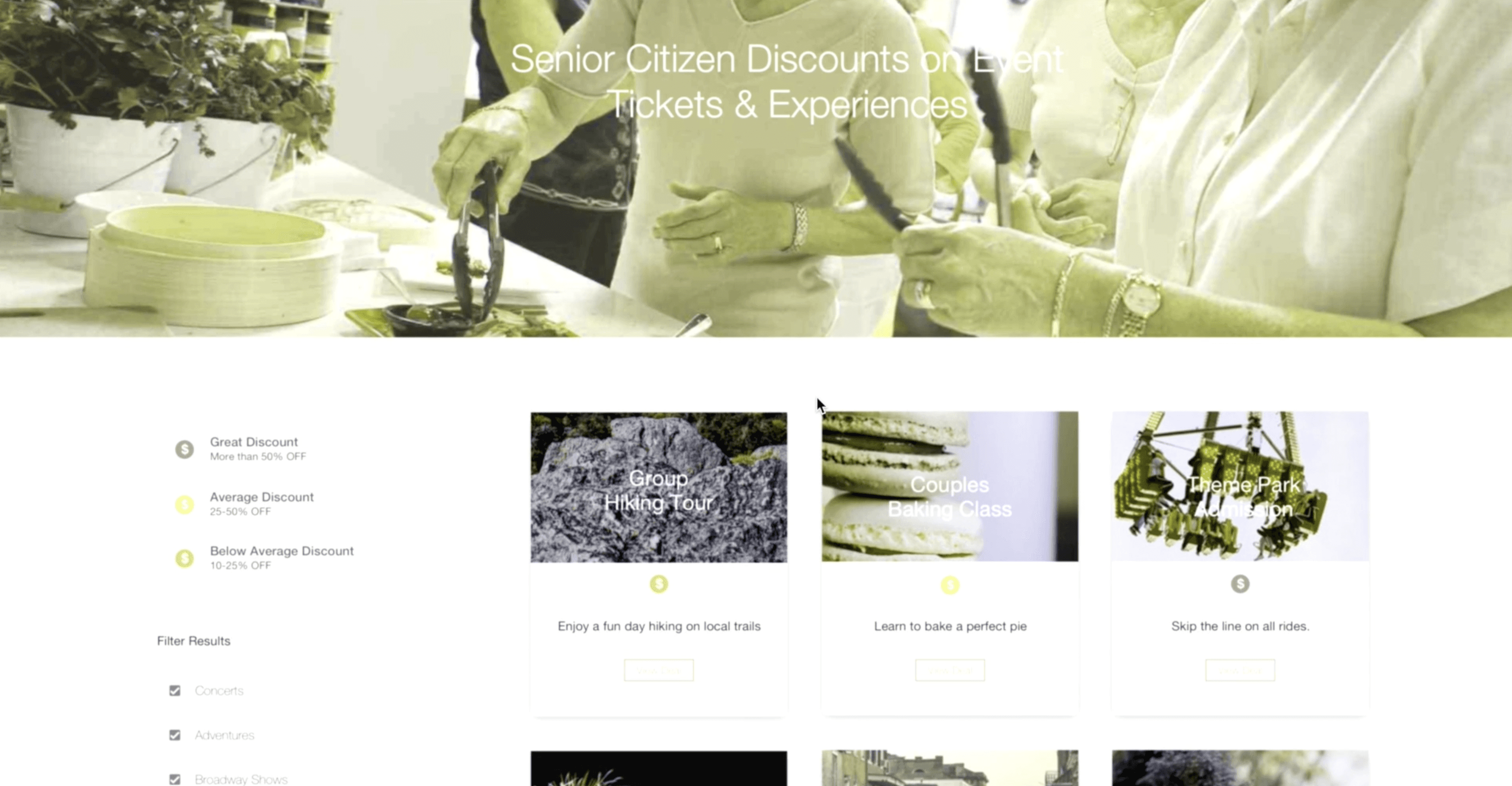

Small targets (buttons, checkboxes) and text size makes it difficult to click on and read.
Small targets (buttons, checkboxes) and text size makes it difficult to click on and read.


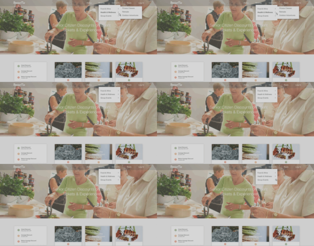
Hover states for navigation makes it difficult to navigate to other pages.
Hover states for navigation makes it difficult to navigate to other pages.

03 REDESIGNING FOR ACCESSIBILITY
03 REDESIGNING FOR ACCESSIBILITY
Rapid Sketches
Rapid Sketches
Rapid Sketches
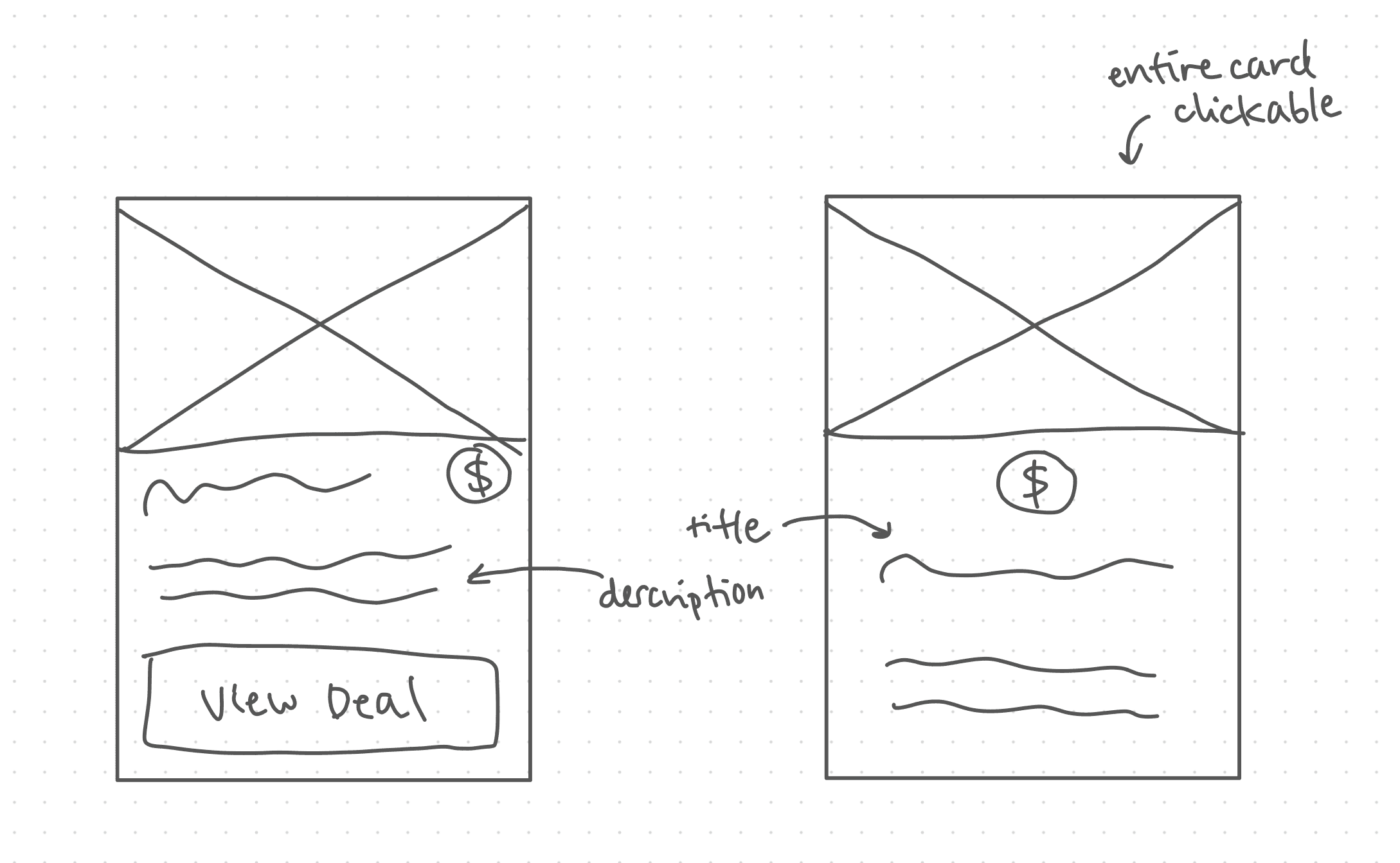
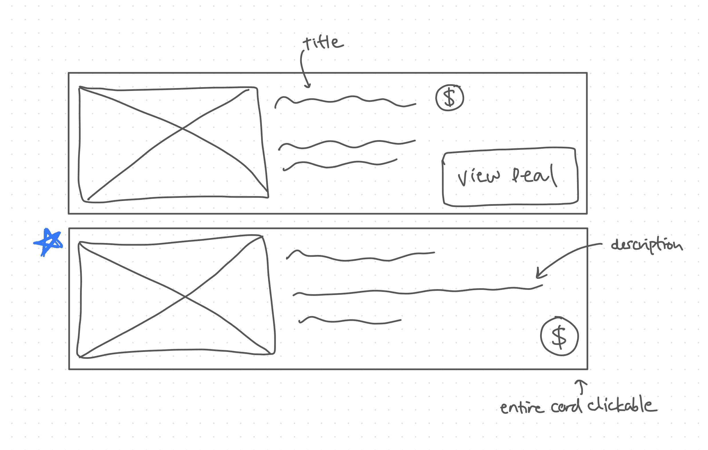
While observing, I noticed several accessibility issues with the card components from both users. I decided to tackle these first as they’re a key component to using SeniorTix.
I sketched out 4 solutions to improve the design and accessibility of the cards.
While observing, I noticed several accessibility issues with the card components from both users. I decided to tackle these first as they’re a key component to using SeniorTix.
I sketched out 4 solutions to improve the design and accessibility of the cards.
Detailed Sketches
Detailed Sketches
Detailed Sketches
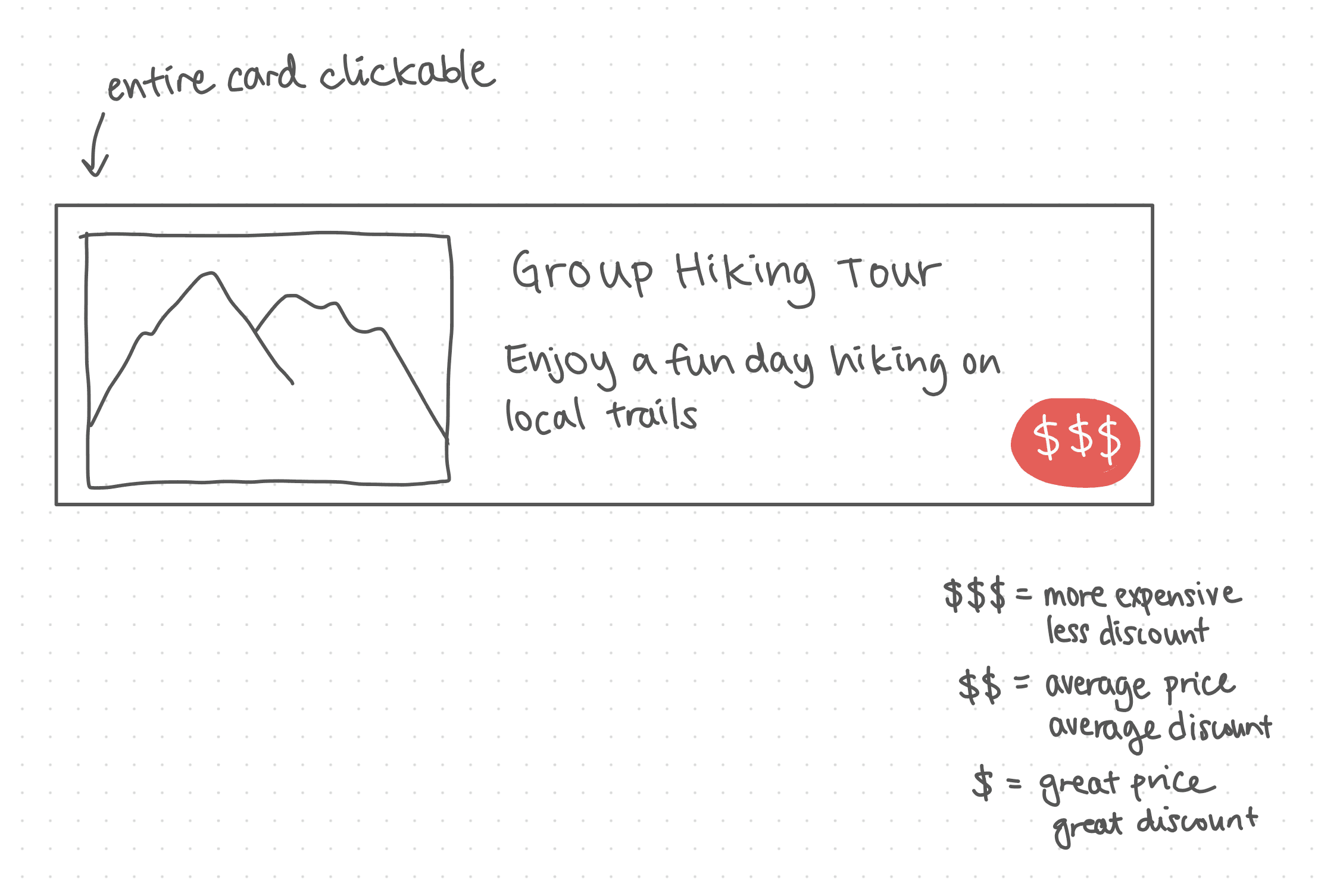
As I looked over the different solutions, I focused on prioritizing card size and legibility. I believe this would improve the experience as it would make the card content easier to read.
I sketched a more detailed version of the design I chose and plan to:
Use larger font sizes to make content easier to read
Use text and colour to differentiate pricing info
Make call-to-actions easier to click on by making the entire card clickable
04 HIGH-FIDELITY PROTOTYPE
04 HIGH-FIDELITY PROTOTYPE
High-Fi
High-Fi
High-Fi
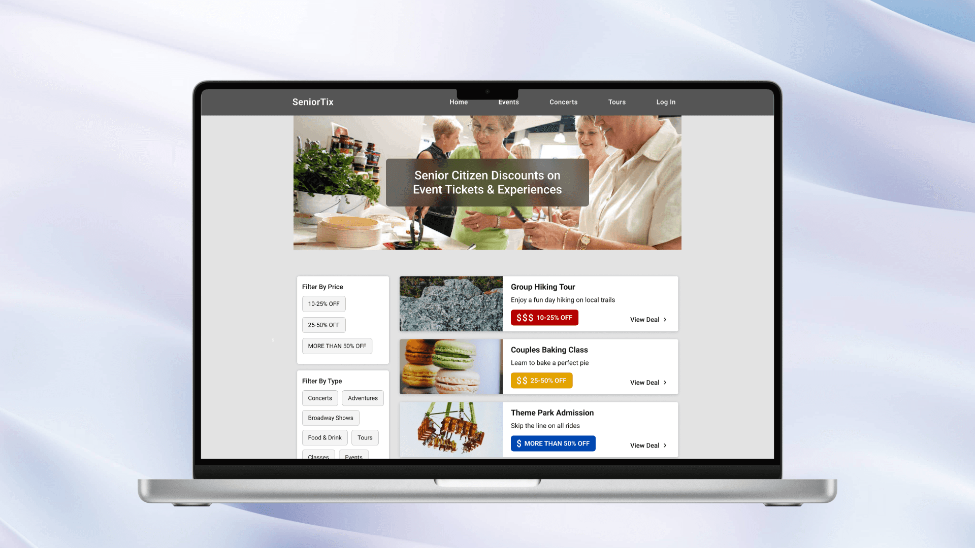
Next, I went into Figma to turn my sketches into high-fidelity. Check out the prototype here: SeniorTix Redesign
Next, I went into Figma to turn my sketches into high-fidelity. Check out the prototype here: SeniorTix Redesign
Changes
Changes
Changes
I used a Colouring for Blindness tool to choose colours for the pricing info that allows people with various types of colour blindness to differentiate between them. I also included different text so colour isn't the only way to differentiate.
I used a Colouring for Blindness tool to choose colours for the pricing info that allows people with various types of colour blindness to differentiate between them. I also included different text so colour isn't the only way to differentiate.
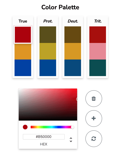
Colouring for Blindness
Colouring for Blindness
Added hover states for filters and cards so users know what’s in focus.
Added hover states for filters and cards so users know what’s in focus.
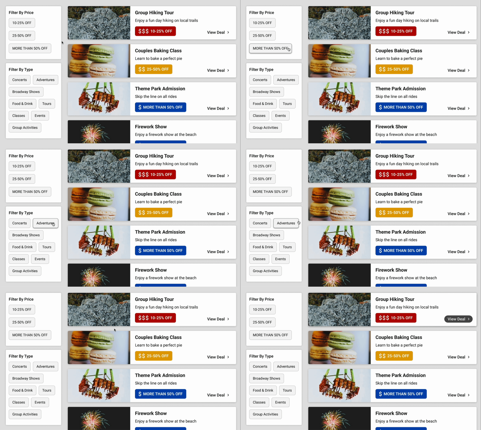

Hover States
Hover States
Increased size of target points by making buttons for filters and navigation larger, and the entire card clickable.
Increased size of target points by making buttons for filters and navigation larger, and the entire card clickable.
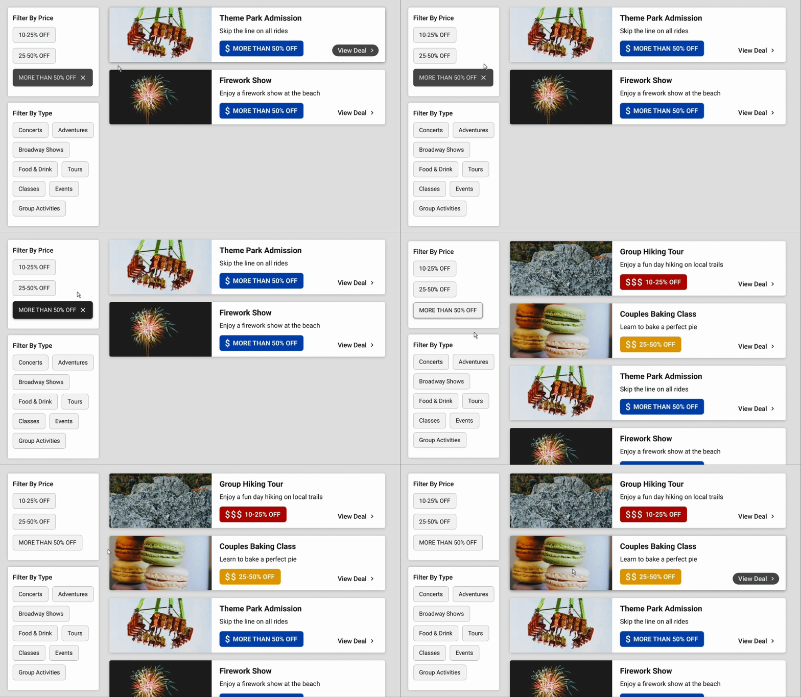

Larger Targets for Fine Motor Impairments/Disabilities
Larger Targets for Fine Motor Impairments/Disabilities
When navigation is clicked, the dropdown menu stays on the page until the user clicks anywhere outside the menu. This removes the frustration of the menu disappearing when the cursor isn’t hovered over the selection.
When navigation is clicked, the dropdown menu stays on the page until the user clicks anywhere outside the menu. This removes the frustration of the menu disappearing when the cursor isn’t hovered over the selection.


Improved Navigation Menus
Improved Navigation Menus
Assessing Accessibility
Assessing Accessibility
Assessing Accessibility
Ensuring target points are large enough and easy to use.
Ensuring target points are large enough and easy to use.
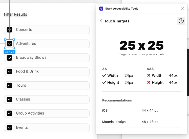

Original Inaccessible Target Size
Original Inaccessible Target Size
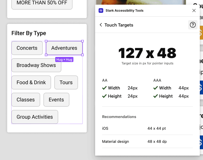

Redesigned Target Size
Redesigned Target Size
Simulating visual impairments to see if the site is still usable and accessible.
Simulating visual impairments to see if the site is still usable and accessible.
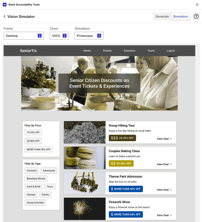


Simulating Colour Blindness (Protanopia)
Simulating Colour Blindness (Protanopia)
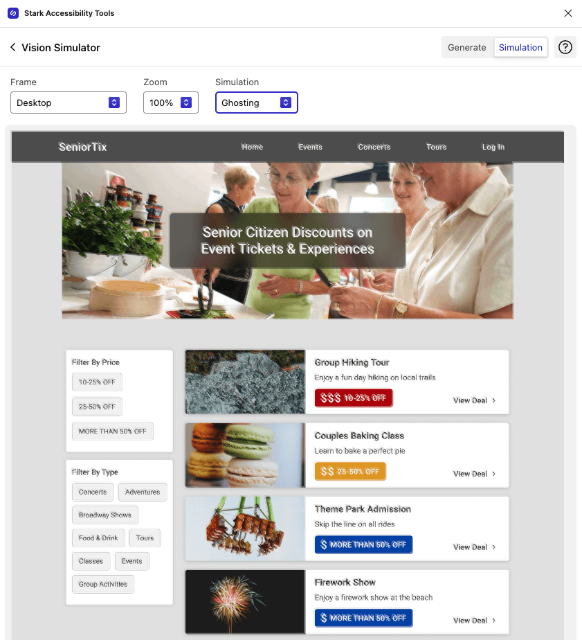


Simulating Blurry/Ghosting Vision
Simulating Blurry/Ghosting Vision
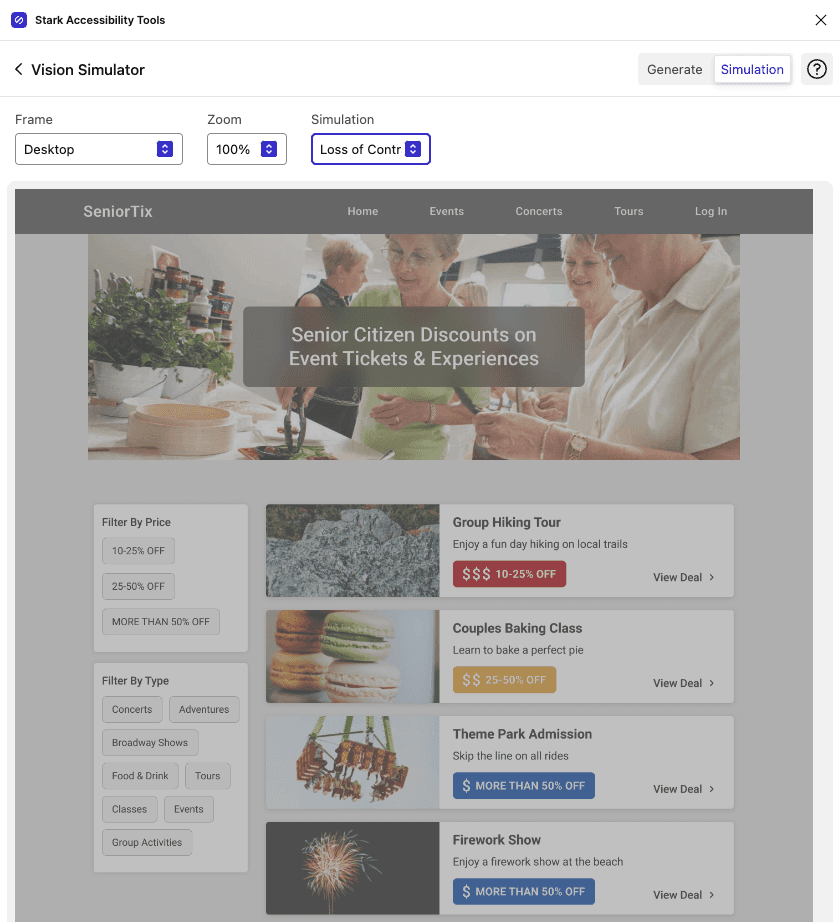


Simulating Low Contrast Vision
Simulating Low Contrast Vision
05 NEXT STEPS & REFLECTION
05 NEXT STEPS & REFLECTION
Next Steps
Next Steps
Next Steps
Here are some next steps I would take to continue improving the SeniorTix experience and continue growing as a designer:
Conduct usability testing to continue improving and validating designs.
Find and correct more accessibility issues with SeniorTix.
Find accessibility issues with other websites to keep improving my accessibility and inclusion evaluations.
Reflection
Reflection
Reflection
After this workshop, I walked away with more valuable knowledge about accessibility and inclusion, and the important differences between the two. When I thought about accessibility prior to this workshop, the first thing that usually came to mind was colour blindness and other visual impairments/disabilities. When designing with accessibility in mind, it’s important to be aware of all different types of impairments/disabilities people can have, and tools like Funkify Disability Simulator help us better understand what these people experience on a daily basis. I’ve not only gained more knowledge about accessibility, but also gained more empathy for people with different levels of ability/disability.
After this workshop, I walked away with more valuable knowledge about accessibility and inclusion, and the important differences between the two. When I thought about accessibility prior to this workshop, the first thing that usually came to mind was colour blindness and other visual impairments/disabilities. When designing with accessibility in mind, it’s important to be aware of all different types of impairments/disabilities people can have, and tools like Funkify Disability Simulator help us better understand what these people experience on a daily basis. I’ve not only gained more knowledge about accessibility, but also gained more empathy for people with different levels of ability/disability.
