Redesign: Bed Bath & Beyond
Redesign:
Bed Bath & Beyond
Redesign:
Bed Bath & Beyond
Project Overview
Project Overview
Bed Bath & Beyond is a home and lifestyle goods company that offers a wide variety of products and options to match all tastes of its consumers. The redesign focused on improving the product cards.
Bed Bath & Beyond is a home and lifestyle goods company that offers a wide variety of products and options to match all tastes of its consumers. The redesign focused on improving the product cards.
Project Scope
Project Scope
Website redesign completed as part of a UX workshop hosted by Bitesize UX.
Website redesign completed as part of a UX workshop hosted by Bitesize UX.
Project Role
Project Role
UX Designer
UX Designer
Tools
Tools
Figma, FigJam
Figma, FigJam
Duration
Duration
August 7, 2023
August 7, 2023
Challenge
Challenge
Use heuristic evaluation to identify usability issues with the site and shopping experience
Conduct a competitive analysis to compare Bed Bath and Beyond’s website
Created a high-fidelity redesign to solve usability issues
Use heuristic evaluation to identify usability issues with the site and shopping experience
Conduct a competitive analysis to compare Bed Bath and Beyond’s website
Created a high-fidelity redesign to solve usability issues
Learnings
Learnings
Use usability heuristics as a framework to guide the evaluation, not as definitive rules for design
When I first learned about usability heuristics, I saw them as a set of rules that designs should abide by. However, all designs are different and might still provide a great user experience even if they don't follow these ‘rules’. They might differ from patterns we’re familiar with but work for that particular context or use.
Heuristic evaluations are a good way to figure out what to test
Research and interviews can require lots of time and resources, and heuristic evaluations are a good way to figure out what to spend our time and energy (and sometimes money!) on fixing.
Little improvements can make a big difference!
Small but meaningful changes can drastically improve user experience. Although this project focused on product cards, a seemingly small aspect of the overall website, improving its consistency and hierarchy can make the experience browsing through hundreds of products less confusing and more enjoyable.
Links to Deliverables
Links to Deliverables
01 CHALLENGE
01 CHALLENGE
Use heuristic evaluation to identify usability issues with the site and shopping experience
Conduct a competitive analysis to compare Bed Bath and Beyond’s website
Created a high-fidelity redesign to solve usability issues
Use heuristic evaluation to identify usability issues with the site and shopping experience
Conduct a competitive analysis to compare Bed Bath and Beyond’s website
Created a high-fidelity redesign to solve usability issues
02 HEURISTIC EVALUATION
02 HEURISTIC EVALUATION
Heuristic
Evaluation
Heuristic Evaluation
Heuristic Evaluation
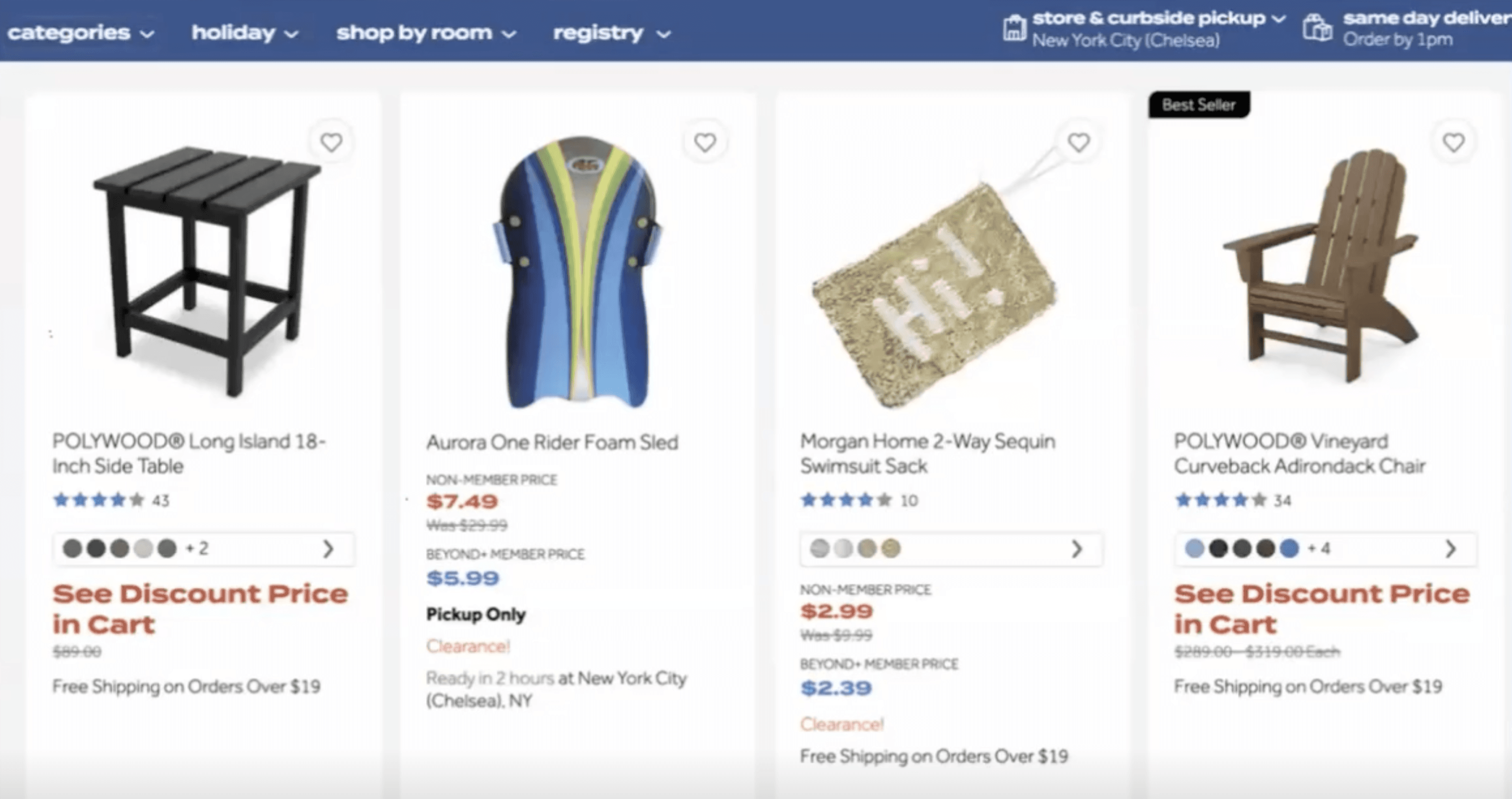
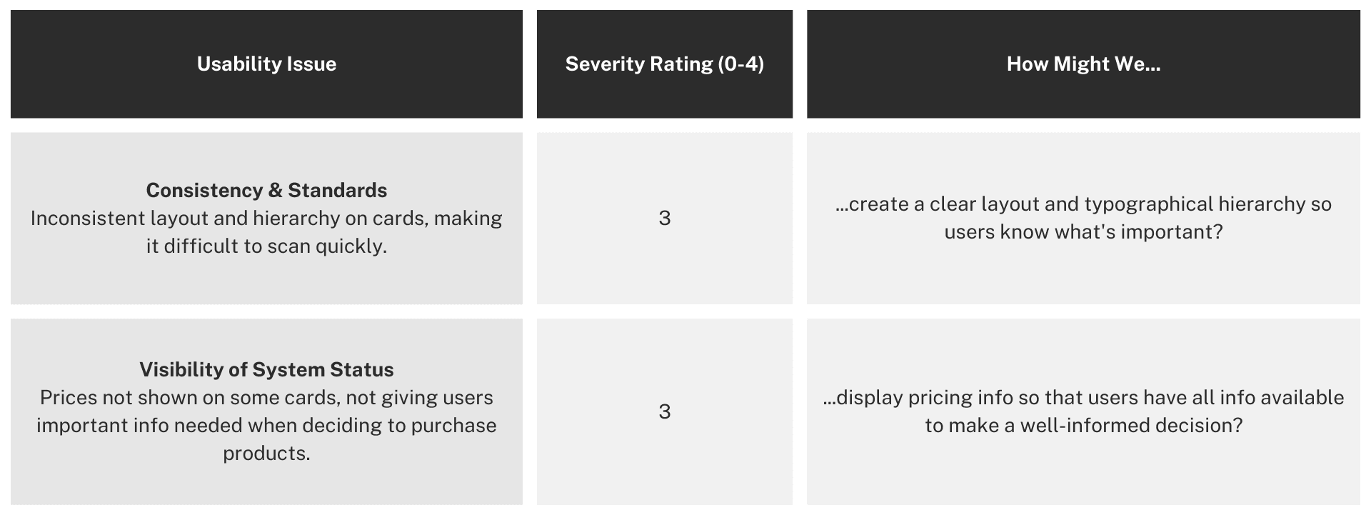
For this heuristic evaluation, we focused on the product cards on the listings page. The most severe issues found were related to consistency and standards, and visibility of system status.
For this heuristic evaluation, we focused on the product cards on the listings page. The most severe issues found were related to consistency and standards, and visibility of system status.


Heuristic Evaluation Findings
Heuristic Evaluation Findings
LEARNING #1: Use usability heuristics as a framework to guide the evaluation, not as definitive rules for design
LEARNING #1: Use usability heuristics as a framework to guide the evaluation, not as definitive rules for design
When I first learned about heuristic evaluations, I would go through a website and note down all the usability problems, then categorize them and make changes based on each heuristic. I saw them as a set of rules that designs should abide by. However, all designs are different and might still provide a great user experience even if they don't follow these ‘rules’. They might differ from patterns we’re familiar with but work for that particular context or use.
03 COMPETITIVE ANALYSIS
03 COMPETITIVE ANALYSIS
Competitive Analysis
Competitive Analysis
Competitive Analysis
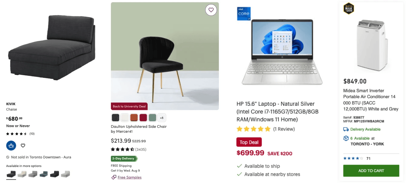
Once usability issues were uncovered, we headed over to FigJam to collaborate and share ideas of direct and indirect competitors that we could compare Bed Bath & Beyond to.
Findings that I wanted to incorporate into my redesign of Bed Bath & Beyond:
All cards follow a consistent layout
Clear typographical hierarchy; most important info typically in larger/bold font
Uses colour to highlight certain info


Competitor Product Cards
Competitor Product Cards
04 IDEATE
04 IDEATE
Rapid Sketches
Rapid Sketches
Rapid Sketches
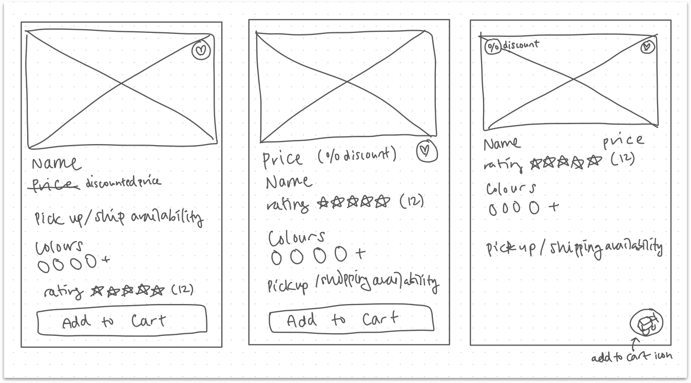
The next step was to create 3 sketches of potential solutions in 3 minutes. This task was definitely challenging, but it pushed me to brainstorm different ways to improve the issues observed in the heuristic evaluation and incorporate strengths from the competitors.
The next step was to create 3 sketches of potential solutions in 3 minutes. This task was definitely challenging, but it pushed me to brainstorm different ways to improve the issues observed in the heuristic evaluation and incorporate strengths from the competitors.
Detailed
Sketches
Detailed Sketches
Detailed Sketches
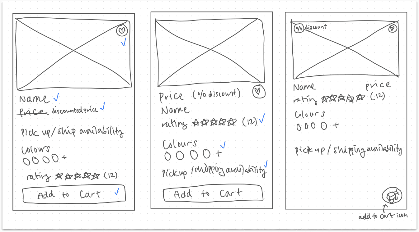
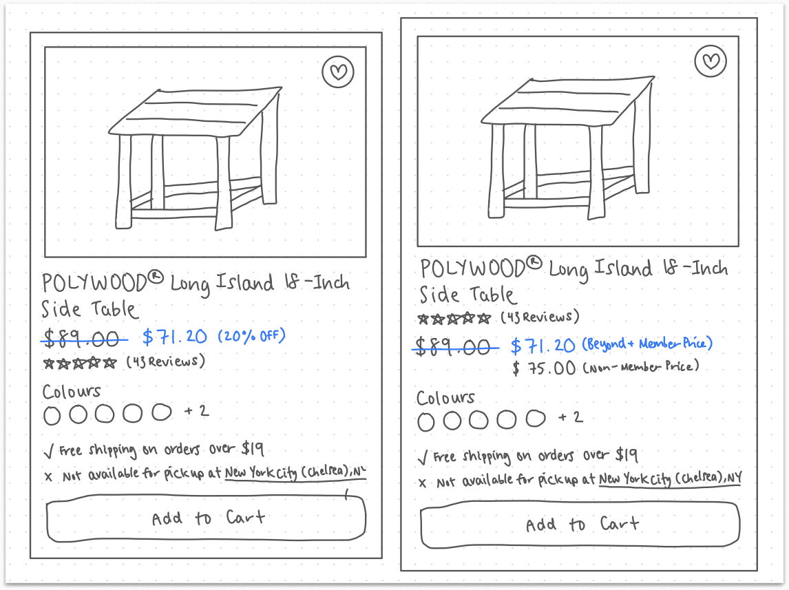
Once I had the initial sketches, I looked at how each card prioritized different information so users know what content is more important. Each design had aspects that I thought worked well and didn’t work well. I highlighted the parts that worked well and incorporated them into the next stage, detailed sketches.
Once I had the initial sketches, I looked at how each card prioritized different information so users know what content is more important. Each design had aspects that I thought worked well and didn’t work well. I highlighted the parts that worked well and incorporated them into the next stage, detailed sketches.
Key Changes
to Implement
Key Changes to Implement
Key Changes to Implement
Having a clear typographical hierarchy lets users know what content is important and helps them scan through hundreds of products easily.
Placing the reviews and exact prices under the item name helps users decide whether it would be a good purchase or not, and lets them know if it's within their budget.
Showing clear shipping and pickup availability gives users a clear understanding of their options.
LEARNING #2: Heuristic evaluations are a good way to figure out what to test
LEARNING #2: Heuristic evaluations are a good way to figure out what to test
Heuristic evaluations offer a great head start on improving user experience, but this isn’t the end just yet! The only way to know if the changes actually improve the experience is to test. Research and interviews can require lots of time and resources, and heuristic evaluations are a good way to figure out what to spend our time and energy (and sometimes money!) on fixing.
05 HIGH-FIDELITY DESIGN
05 HIGH-FIDELITY DESIGN
High-Fi
High-Fi
High-Fi
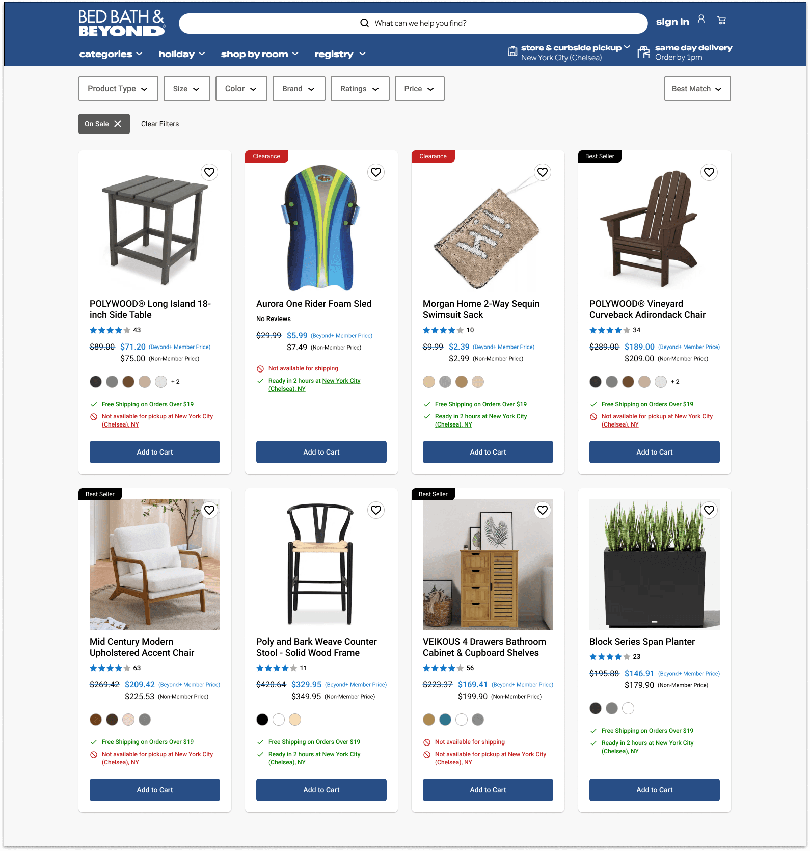
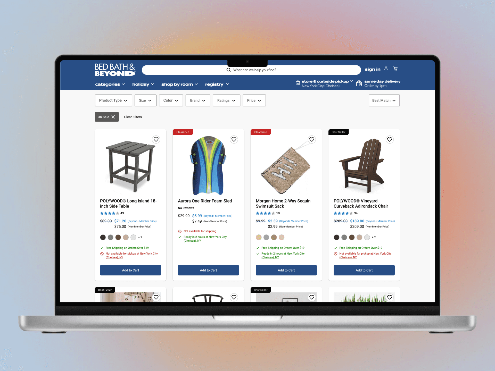
Finally, I went into Figma to create a high-fidelity version of the design. I used colour to help differentiate important information like pricing, and available/unavailable purchase options.
Kept the blue for reviews and pricing the same as the original design to remain consistent with Bed bath & Beyond's branding.
Listed available/unavailable purchase options at the bottom, similar to Best Buy, but used green and red to better distinguish the two so users can clearly understand the options they have.
LEARNING #3: Little improvements can make a big difference!
LEARNING #3: Little improvements can make a big difference!
Small but meaningful changes can drastically improve user experience. Although this project mainly focused on the layout of the product card, a seemingly small aspect of the overall website, improving its consistency and hierarchy can make the experience browsing through hundreds of products less confusing and more enjoyable.
06 NEXT STEPS & REFLECTION
06 NEXT STEPS & REFLECTION
Next Steps
Next Steps
Next Steps
Here are some next steps I would take to continue improving the Bed Bath and Beyond experience and continue growing as a designer:
Conduct usability testing to continue improving and validating designs
Continue practicing rapid sketching – I definitely underestimated how hard 3 sketches in 3 minutes would be!
Learn from apps and websites I use regularly, what works and what doesn’t, and how would I improve usability?
Reflection
Reflection
Reflection
In the short amount of time spent at this workshop, I definitely walked away with some good tips and another point of confidence gained as a designer. As important as usability heuristics are, I learned that I shouldn’t be treating them as a set of rules, but rather as guidelines, and that context and use are just as important to consider. What I love about design is that they can be different, and different solutions are required to solve different problems; not all designs have to strictly follow the same set of rules.
In the short amount of time spent at this workshop, I definitely walked away with some good tips and another point of confidence gained as a designer. As important as usability heuristics are, I learned that I shouldn’t be treating them as a set of rules, but rather as guidelines, and that context and use are just as important to consider. What I love about design is that they can be different, and different solutions are required to solve different problems; not all designs have to strictly follow the same set of rules.
